

Hello, friends! I hope you are well and having a great day. I'd love to hear what is new with you and what you're working on at the moment.
I've been busy in my craft room. It's time for another new challenge at The Frilly and Funkie Blog! Our hostess this time is the lovely Kathy with the theme of Put Your Inking Cap On. Her guidelines are as follows: Create a vintage or shabby chic mixed media project without using patterned paper of any kind. You may use Distress Inks, Sprays, Paints, Stencils, Stamps, Embossing powders or any medium you choose but NO patterned paper allowed!
At the end of the challenge the team will choose their top four picks. Our first place winner will be invited to join us in a Guest DT spot at The Frilly and Funkie Blog. Three additional talented participants will receive badges to display on their blogs. Everyone who enters and adheres to the challenge guidelines will be entered into a drawing to win a $25 spending spree at The Funkie Junkie Boutique! For entry specifics and inspiration from my fabulous teammates just click on the blog link above.
This challenge is super difficult for me. I'm quite disappointed with my results as it is obviously does not reflect my style. Y'all know how much I love my patterned papers, and I find myself a bit lost without any. I'm sorry I have not done justice with this wonderful new journal cover from Eileen Hull's brand release (from which she generously sent us each a die cut cover). I have reworked this three times and I am finally raising the white flag. But what a great learning experience this is! I'm thankful for the opportunity to get out of my comfort zone. I rationalize that we all have projects that don't turn out as planned now and again, right? I'm bravely posting it and I haven't even made the photos as teeny tiny as possible (I actually thought about that!).

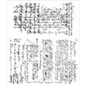
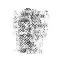
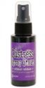
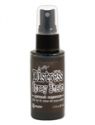
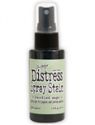
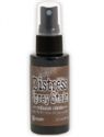
I'm working with plain white cardstock for this and it is rejecting my usual distressing and layering techniques. There is a ton of stamping but most of it is covered up by the Distress Sprays... 'sad sigh'. The flowers are from my stash and colored with Distress Sprays. There is also a die cut butterfly under there somewhere. Full disclosure: the journal base is supposed to be a pastel green.

I think the universe must know I'm a feeling little down and need a pick-me-up, as the below goodies arrived on my doorstep just as I was heading for my chocolate stash:


What girl doesn't love a little Chanel? It's actually only refills of some of my skin care and makeup products, but they always wrap it up like it's worth a million dollars. They even put the 'free samples' in sweet little Chanel pouches. Best of all, I didn't eat the chocolate!!
That's all I have for today, but don't give up on me. I refuse to be thwarted (except possibly by this journal) and I WILL be back-lol. I plan to purchase this die set and create one of these journals in my very own style. I hope to see you over at the Frilly and Funkie Blog so I can admire your beautiful creations! Sending wishes to you for all things wonderful.
Hugs, 

 |  |  |  |  |
 |  |  |  |  |
 |  |  |  |  |
 |  |  |  |  |
 |  |  |  |  |
 |

Well, I have to say Nancy, I think this is stunning!!! You did a marvelous job. I love the colours on the background and the stamping and the purple flower cluster sets it off beautifully!! I love it!!
ReplyDeleteWonderful work Nancy, hope you are feeling better.
ReplyDeleteElaine H X
Nancy, I really love this. And I'm not fibbing! It has a wonderful, natural rustic feel. I can see your layers of stamping peeking through the ink. The cluster of flowers really pops against the background. It makes me think of lilacs on a rainy day. The white stitching, the distressing and the wonderful lace border add lovely texture and visual interest. I know you are disappointed, but I think you did a marvelous job. This was out of my comfort zone, too....but I did learn a lot in the process.
ReplyDeleteI think your journal looks wonderful, Nancy!
ReplyDeleteYou are definitely too hard on yourself because this is wonderful. I can still see all your stamping and if you had shrunk the photos, that would not have been possible. I don't mind that the inks covered the pastel green because the cover has such a rich look. The flowers are a lovely pop of purple (welcome to the club) and the lace is a perfect added touch. The rusty key adds a little grunge that pairs well with the pretty. I love it when you veer away from your signature style because the results are always stunning and unexpected.
ReplyDeleteHugs!
Cec
I really like this Nancy, really! My favorite part is the muted stamping, which to you was a shame. Isn't it funny that we each see something different in a creation. Glad the lovely package cheered you up. This color palette is rich and wow! Hugs, Autumn
ReplyDeleteWhat a rich and wonderful color scheme. the flowers are delightful as is your journal!
ReplyDeleteNancy--full disclosure here...I LOVE this! Just to let you know I usually visit the Frilly team in order of the post, but I skipped ahead because I just had to see how you made this! Gorgeous colors and a lovely background and design! I'm very pleased with your detour from your usual style--although I love that, too!So happy you were able to avoid the chocolate! Keep your chin up! (But I can totally relate...crafting's not where it's at right now with me.) Sending hugs!
ReplyDeleteBeautiful Nancy. A gorgeous background and such wonderful dimension added with those flowers.
ReplyDeleteIt is so funny how we all see different things and enjoy different styles. I always love your creations and though this doesn't scream NANCY to me, I absolutely adore it. I guess it is my style. I love the deep golden brown lace and that wonderful stamped layer. The flowers add such an explosion of color and make a perfect focal point. I'm so glad you shared the lovely photos with us. I'm sure you have inspired many of our visitors at Frilly and Funkie with this beautiful piece of work.
ReplyDeleteHugs,
Linda
Thank you so much for sharing Nancy. We all feel so deflated when projects don't turn out the way they appear in our imaginations but as the previous comments have said, I think you're being WAY too hard on yourself. I love that verdigris green base and the purple flowers on top and SO wish I could fly over to your place to rescue it from wherever it has been abandoned. I would also LOVE to see what you create with another journal and your favourite patterned papers as I bet that would be knockout xx
ReplyDeleteNancy I don't know what you are talking about- your journal is amazing! The flowers are such a beautiful shade of purple (and I am not even a big fan of that color)- it all works together if you ask me :-) Once in a while I get a stuck on something and it's a bad feeling but thankfully the motivation/inspiration returns and then I am so happy it's back- makes me appreciate it more... Thanks for working with my die!
ReplyDeleteYour way too hard on yourself!!! This journal is absolutely gorgeous!!! Be proud of yourself you mastered the challenge beautifully!!!!💕💕💕
ReplyDeleteIt may not be your usual style Nancy - but it is certainly NOT a disappointment! Maybe you need to step back and look at it as something someone else created to appreciate it?! I love that gorgeous lace edge and those voluminous purple blooms! and the background is delightful! Julia xx
ReplyDeleteSo interesting reading your thoughts about creating this, Nancy, as I think you've more than done Eileen's die justice - I think this is incredibly beautiful. The main panel with the butterflies has such lovely depth and atmosphere, and accompanied by those stunning flowers it has a really gorgeous vintage look - like an ancient volume lying in a dusty library. Amazing!
ReplyDeleteAlison x